loading…
en/
Browse all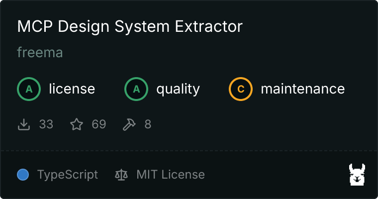
freema/mcp-design-system-extractor
FreeExtracts component information from Storybook design systems. Provides HTML, styles, props, dependencies, theme tokens and component metadata for AI-powered des
About
Extracts component information from Storybook design systems. Provides HTML, styles, props, dependencies, theme tokens and component metadata for AI-powered design system analysis.
README
A Model Context Protocol (MCP) server that extracts component information from Storybook design systems. Connects to Storybook instances and extracts HTML, styles, and component metadata.
Installation
Using Claude CLI (Recommended)
claude mcp add design-system npx mcp-design-system-extractor@latest \
  --env STORYBOOK_URL=http://localhost:6006
With self-signed certificate:
claude mcp add design-system npx mcp-design-system-extractor@latest \
  --env STORYBOOK_URL=https://my-storybook.example.com \
  --env NODE_TLS_REJECT_UNAUTHORIZED=0
Using npm
npm install -g mcp-design-system-extractor
Then configure in your MCP client (see Environment Variables).
From Source
git clone https://github.com/freema/mcp-design-system-extractor.git
cd mcp-design-system-extractor
npm install && npm run build
npm run setup  # Interactive setup for Claude Desktop
Key Dependencies
- Puppeteer: Uses headless Chrome for dynamic JavaScript component rendering
- Chrome/Chromium: Required for Puppeteer (automatically handled in Docker)
- Works with built Storybook distributions
Features
- List Components: Get all available components from your Storybook with compact mode
- Extract HTML: Get the rendered HTML of any component (async or sync mode)
- Search Components: Find components by name, title, category, or purpose
- Component Dependencies: Analyze which components are used within other components
- Theme Information: Extract design system theme (colors, spacing, typography)
- External CSS Analysis: Fetch and analyze CSS files to extract design tokens
- Async Job Queue: Long-running operations run in background with job tracking
Environment Variables
| Variable | Description | Default |
|---|---|---|
STORYBOOK_URL |
URL of your Storybook instance | http://localhost:6006 |
NODE_TLS_REJECT_UNAUTHORIZED |
Set to 0 to skip SSL certificate verification (for self-signed certs) |
1 |
Example with self-signed certificate:
{
  "mcpServers": {
    "design-system": {
      "command": "node",
      "args": ["/path/to/dist/index.js"],
      "env": {
        "STORYBOOK_URL": "https://my-storybook.example.com",
        "NODE_TLS_REJECT_UNAUTHORIZED": "0"
      }
    }
  }
}
Usage
See DEVELOPMENT.md for detailed setup instructions.
Available Tools (9 total)
Core Tools
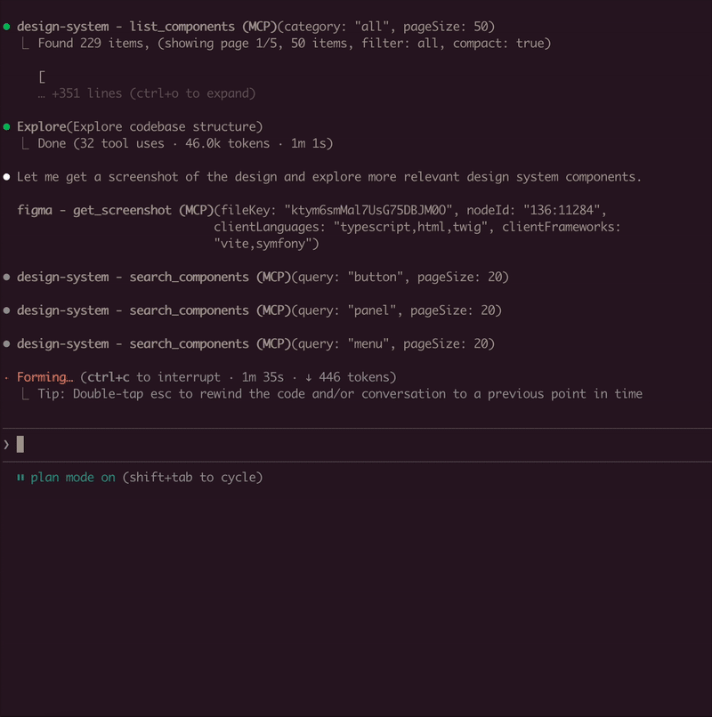
list_components
- Lists all available components from the Storybook instance
- Use
compact: truefor minimal output (reduces response size) - Filter by
categoryparameter - Supports pagination with
pageandpageSize(default: 20)
get_component_html
- Extracts HTML from a specific component story
- Async by default: Returns
job_id, usejob_statusto poll for results - Set
async: falsefor synchronous mode (usestimeoutparameter) - Use
variantsOnly: trueto get list of available variants (sync, fast) - Optional
includeStyles: truefor CSS extraction (Storybook CSS filtered out) - Story ID format:
"component-name--story-name"or just"component-name"(auto-resolves to default variant)
search_components
- Search components by name, title, category, or purpose
query: Search term (use"*"for all)purpose: Find by function ("form inputs", "navigation", "feedback", "buttons", etc.)searchIn: "name", "title", "category", or "all" (default)- Supports pagination with
pageandpageSize
Component Analysis Tools
- get_component_dependencies
- Analyzes rendered HTML to find which other components are used internally
- Detects React components, web components, and CSS class patterns
- Requires story ID format:
"component-name--story-name"
Design System Tools
get_theme_info
- Extracts design system theme (colors, spacing, typography, breakpoints)
- Gets CSS custom properties/variables
- Use
includeAll: truefor all CSS variables
get_external_css
- DEFAULT: Returns only design tokens + file stats (avoids token limits)
- Extracts & categorizes tokens: colors, spacing, typography, shadows
- Use
includeFullCSS: trueonly when you need full CSS content - Security-protected: only accepts URLs from same domain as Storybook
Job Management Tools
job_status
- Check status of an async job
- Returns:
status,result(when completed),error(when failed) - Poll this after calling
get_component_htmlin async mode
job_cancel
- Cancel a queued or running job
- Returns whether cancellation was successful
job_list
- List all jobs with their status
- Filter by
status: "all" (default), "active" (queued/running), "completed" - Returns job list + queue statistics
Example Usage
// List all components (compact mode recommended)
await list_components({ compact: true });

// Search for components
await search_components({ query: "button", searchIn: "name" });

// Find components by purpose
await search_components({ purpose: "form inputs" });

// Get variants for a component
await get_component_html({
  componentId: "button",
  variantsOnly: true
});
// Returns: { variants: ["primary", "secondary", "disabled"] }

// Get HTML (async mode - default)
await get_component_html({ componentId: "button--primary" });
// Returns: { job_id: "job_xxx", status: "queued" }

// Poll for result
await job_status({ job_id: "job_xxx" });
// Returns: { status: "completed", result: { html: "...", classes: [...] } }

// Get HTML (sync mode)
await get_component_html({
  componentId: "button--primary",
  async: false,
  timeout: 30000
});
// Returns: { html: "...", classes: [...] }

// Get HTML with styles
await get_component_html({
  componentId: "button--primary",
  async: false,
  includeStyles: true
});

// Check all running jobs
await job_list({ status: "active" });

// Extract theme info
await get_theme_info({ includeAll: false });

// Get design tokens from CSS
await get_external_css({
  cssUrl: "https://my-storybook.com/assets/main.css"
});
AI Assistant Usage Tips
- Start with discovery: Use
list_componentswithcompact: true - Get variants first: Use
get_component_htmlwithvariantsOnly: true - Use async for HTML: Default async mode prevents timeouts on large components
- Poll job_status: Check job completion before reading results
- Search by purpose: Use
search_componentswithpurposeparameter
Example Prompts
Once connected, you can use natural language prompts with Claude:
Component Discovery:
Show me all available button components in the design system
Building New Features:
I need to create a user profile card. Find relevant components
from the design system and show me their HTML structure.
Design System Analysis:
Extract the color palette and typography tokens from the design system.
I want to ensure my new component matches the existing styles.
Component Migration:
Get the HTML and styles for the "alert" component. I need to
recreate it in a different framework while keeping the same look.
Multi-Tool Workflow:
First list all form-related components, then get the HTML for
the input and select components. I'm building a registration form.
How It Works
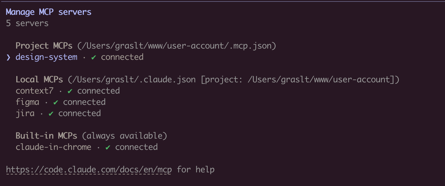
Connects to Storybook via /index.json and /iframe.html endpoints. Uses Puppeteer with headless Chrome for dynamic JavaScript rendering. Long-running operations use an in-memory job queue with max 2 concurrent jobs and 1-hour TTL for completed jobs.
Troubleshooting
- Ensure Storybook is running and
STORYBOOK_URLis correct - Use
list_componentsfirst to see available components - For large components, use async mode (default) and poll
job_status - Check
/index.jsonendpoint directly in browser - SSL certificate errors: Set
NODE_TLS_REJECT_UNAUTHORIZED=0for self-signed certificates - See DEVELOPMENT.md for detailed troubleshooting
Requirements
- Node.js 18+
- Chrome/Chromium (for Puppeteer)
- Running Storybook instance
Development
See DEVELOPMENT.md for detailed development instructions.
Author
Created by Tomáš Grasl
License
MIT
Install freema/mcp-design-system-extractor in Claude Desktop, Claude Code & Cursor
Run in your terminal:
claude mcp add freema-mcp-design-system-extractor -- npx FAQ
Is freema/mcp-design-system-extractor MCP free?
Yes, freema/mcp-design-system-extractor MCP is free — one-click install via Unyly at no cost.
Does freema/mcp-design-system-extractor need an API key?
No, freema/mcp-design-system-extractor runs without API keys or environment variables.
Is freema/mcp-design-system-extractor hosted or self-hosted?
Self-hosted: the server runs locally on your machine via the install command above.
How do I install freema/mcp-design-system-extractor in Claude Desktop, Claude Code or Cursor?
Open freema/mcp-design-system-extractor on unyly.org, pick your client tab (Claude Desktop, Claude Code, Cursor) and press Install — the config is generated automatically, no JSON editing.


